Change Adoption
How HCM tools help HR retain talent in organizational change
As the workforce continues to evolve, company leaders need to rethink how they approach HCM systems — not just as…
Read article

03/30/2022
by Hayley Rabe

At the start of the year, we are typically inundated with tips to improve ourselves, our schedule, our body, our family, and our performance at work. The idea of visualizing our goals is one concept I see (pun intended) over and over. However, a quarter of the way into the year, your vision board may be gathering dust as your projects have started to derail or fall by the wayside. May I suggest we reframe the value we see in this visualization exercise? Let’s understand why it’s helpful, when it’s valuable, and how to easily apply it – specifically as we look at successful change management and its impacts on the advancement of our initiatives.
Change is hard. As a person with a full schedule and many daily responsibilities, the pressure to understand something new or complex outside of your typical routine is a lot to ask. When both competency and efficiency are put at risk with a process or product change, the status quo can look more tempting.
To remediate this, I encourage the use of visual communication to improve project management as a whole. Visual communication — or the use of icons, graphs, and pictures to convey ideas and information — can introduce topics, gain buy-in, and encourage adoption. Using visuals can help us reach our goals of sustainable change.
Visual elements have scientific support for their effectiveness based on the way the brain works. Not only do you understand information faster, but you also remember it better. According to studies, the brain processes images 60,000 times faster than text. When a person is asked to recall information three days later, on average, he or she can only recall 10% of text-based information. Information recall jumps to 65% when a picture or graphic is added.
Think about the implications of this during an onboarding session with a new hire or when meeting with an executive who makes multiple decisions every day. Visuals help get your information more attention, are easily digestible, and are more likely to be remembered later.
For the high impact that visual communication has, there are several low-effort steps you can take to apply visuals to trainings, emails, and presentations. Check out the list below for some quick steps to start incorporating visuals in your communications today.
1. Know when to use a visual. Before starting, think through whether the information could be communicated visually or with visual support.
– Translate task-based instructions to a checklist or simple roadmap. This makes navigating unfamiliar instructions simple, allows overwhelmed employees to take the path of least resistance, and helps eliminate excuses to resist change.
– Simplify complex ideas by using if/then statements or metaphors. This can become a shortcut to mutual understanding and encourage faster, confident decision making.
2. Decide the format. These ideas can be applied to PowerPoints or emails, or can be expanded to complementary material on a larger initiative. Decide which format fits your information best.
– For information that needs to be easily understood and/or referenced often, one-pagers or infographics provide a quick way for employees to learn or recall information. Think of something that people would want to print out and hang at their desks for reference.
– For a more complex change, something in a training format may be needed – add screenshots and graphics to a slide or record a video walkthrough.
– For a simple reminder that the change is occurring or a push to where resources can be accessed, use banners, posters, and flyers.
3. Build an overview. This overview should be based on what information is important and how the reader will digest the information.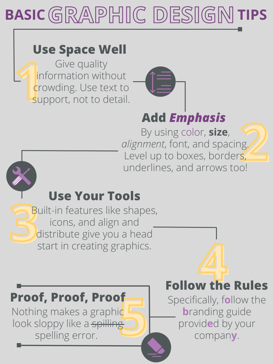
– Do you want them to go step by step? Use a checklist or process flow.
– Do you want to help them organize and understand information? Group it into chunks on the page, make a comparison, or use a metaphor.
4. Follow basic graphic design tips. Graphic design is not something you need a degree in to be able to use. Using your best judgment and leveraging tools like PowerPoint is a great start. Here are some things to keep in mind while you’re creating a design:
– Use space well to give quality information without crowding. Use text to support, not to detail.
– Add emphasis through color, size, alignment, font, and spacing. Level up to boxes, borders, underlines, and arrows too!
– Use your tools. Built-in features like shapes, icons, and align and distribute give you a head start in creating graphics.
– Follow the rules, specifically the branding guide provided by your company.
– Proof, Proof, Proof. Nothing makes a graphic look sloppy like a spelling error. Don’t become so focused on colors and shapes that you forget the basics.
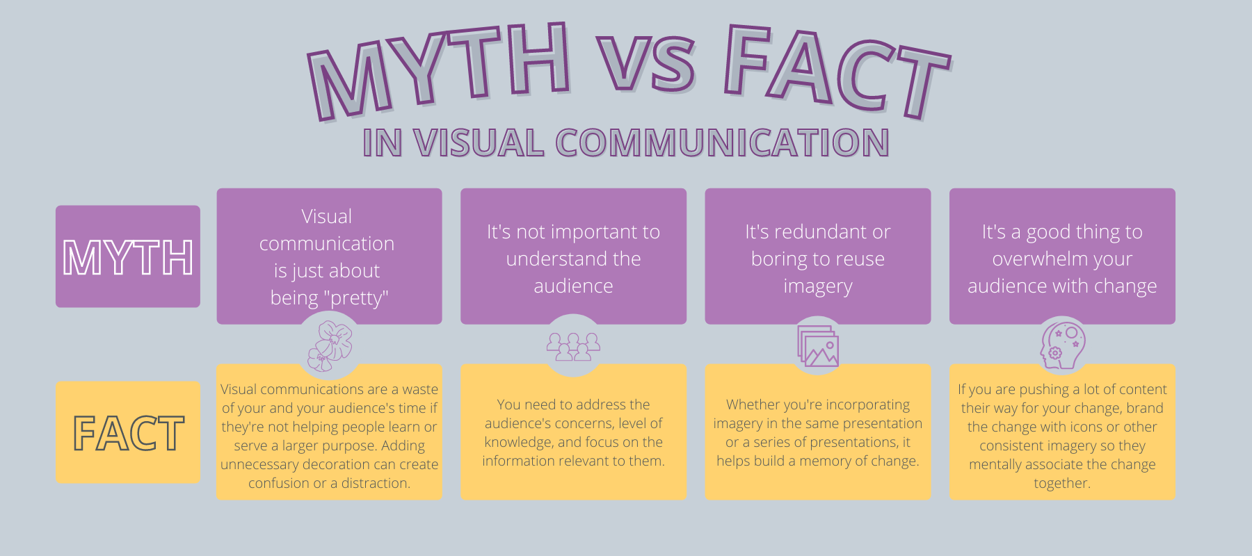
Myth: It’s just about being “pretty.”
Fact: Visual communications can be a waste of time if they’re not helping people learn or serve a larger purpose. Adding unnecessary decoration will likely create confusion or a distraction.
Myth: It’s not important to understand the audience.
Fact: You need to address the audience’s concerns, level of knowledge, and focus on the information relevant to them.
Myth: It’s redundant or boring to reuse imagery.
Fact: Whether you’re incorporating imagery in the same presentation or a series of presentations, it helps build a memory of change. This also applies to taking inspiration from Google, quality marketing content, and other presentations. The spam emails in your junk folder likely have a highly paid graphic designer behind them. While you shouldn’t directly copy, these resources can be helpful launching pads.
Myth: It’s a good thing to overwhelm your audience with change.
Fact: Be aware of other initiatives your audience may be subject to at the same time. Additionally, if you are pushing a lot of content their way for your change, brand the change with icons or other consistent imagery so they mentally associate the change together and don’t feel that too much is being asked of them.
It turns out the saying is true when it comes to easing change for our teams – if they can see it, they can believe it. With minimal effort, visual communication can help employees understand the importance of change and embrace new ideas more quickly. Even beyond classical change management, implementing visual communications helps break down big ideas into more palatable tasks for the brain to handle.
Business insights
Change Adoption
As the workforce continues to evolve, company leaders need to rethink how they approach HCM systems — not just as…
Read article
Change Adoption
Manufacturing leaders have experienced a variety of changes in recent history because of technology advancements….
Read article

Change Adoption
What makes a project successful? “On time” and “on budget” are two of the most common responses. While true, these…
Read article