Workforce Technology
How HCM tools help HR retain talent in organizational change
As the workforce continues to evolve, company leaders need to rethink how they approach HCM systems — not just as…
Read article

07/22/2021
by Tom Cartwright and Marisa Troxell

It seems that every time we log onto an app, some button has moved or the colors have become slightly more vibrant or a new feature has been added. This is due to companies constantly trying to keep up with ever-evolving mobile user experience (UX) best practices as they gain more insight into their users. For example, if you move the app shopping button on the screen closer to a user’s thumb, it is more likely that they will accidentally tap it and become interested in products the company is offering.
In a previous insight article, we touched on two of the four key focus areas for launching a successful employee-facing mobile app:
The first two focus areas above are the “what” that you want out of your app. In this blog, we will address the “how” of your app. We will discuss some mobile UX best practices and how to approach the concept of continuous improvement.
Digital transformation, specifically in mobile apps, has provided many lessons that can help guide and shape mobile app design principles as you create the optimal mobile app user experience for your employees. Some of the most common mobile app best practices include the following:
In this blog, we will discuss some mobile UX best practices to consider when designing an employee-facing app. Following as many best practices as possible will ensure your app is adopted and utilized by your employees.
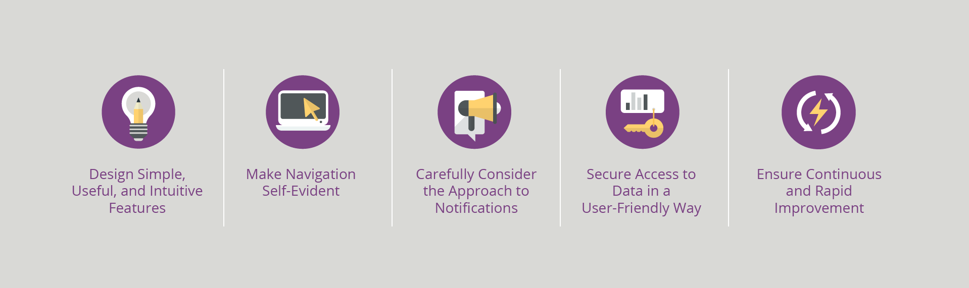
Successful mobile apps focus on a limited set of features. Prioritize app details or tasks and focus on what is important for your organization while trimming out “nice-to-have” items. The application must minimize user effort to complete a task. If possible, larger tasks can be broken down into smaller steps. Consider using defaults to auto-populate, auto-complete, or predict commonly used information or inputs in the process. If your app requires backend information as part of the process, carefully consider the user experience to ensure a cohesive approach.
Here are just a few mobile UX best practices to follow when designing your app:
The key to making a useful and intuitive mobile experience is to start with the end in mind. Ask yourself what the user needs to achieve and keep that process as simple as possible. If possible, work with a UX/UI professional to gather their input and design ideas.
Navigation should drive mobile app users to engage and interact with the features and content. When it comes to navigation, the most important design principle is to occupy the minimum amount of space on a mobile device screen while making sure you make the priority features easily accessible.
Think carefully about what types of messages need to be sent to users via the app. Useless messaging or annoying notifications are one of the primary reasons users uninstall or fail to adopt mobile apps. Every message must count.
If the information is urgent and requires immediate attention, consider using a push notification to get the user’s attention even when they are not using the app. If it is less critical and does not require timely feedback or response, an email could be beneficial. Best practice is to provide your employees control over the notifications they wish to receive. For example, a user may only want to see notifications upon opening the app. In that case they would opt for in-app notifications.
Examples of different types of messaging methods include the following:
The most important consideration to a messaging approach is that you do not overwhelm your user.
Access to data and information contained in back-end systems and databases will most likely be required for your employee-facing mobile applications. Application programming interfaces, or APIs, are typically used to provide information in those back-end systems to your user in their mobile app. Carefully consider the need for information and data in each step of the app’s workflow and how you can securely give your employees simple and useful access to that information. Your mobile apps will need to determine a user’s identity and enforce role-based access to data and information.
Another key security consideration for mobile app design is centered on ease of use. Data must be appropriately secured and protected, yes, but the security measures should not infringe upon an intuitive user experience for accessing the app and login. Consider some of the following approaches:
If the mobile app contains cumbersome or redundant security controls, users will simply refrain from using the app or find work arounds that can compound the issue with insecure methods (e.g., the user may resort to offline or manual documentation in lieu of using the app for secure document access). Modern security solutions provide many ways to secure and control access without comprising the user experience.
Mobile apps are synonymous with agility and therefore must be flexible and adaptable in our ever-changing and fast-paced world. Mobile users expect continuous app updates. To be successful in today’s world, businesses must be agile in terms of listening and responding to user needs. Mobile apps, by nature, will help increase business agility by enabling companies to move quickly on app improvement opportunities.
To foster continuous improvement, establish automated feedback systems that will allow for continuous evaluation and measurement of the impact of mobile app designs, processes, navigation, etc. Consider the following for your feedback approach:
Collect – Gather input from employees including quantitative feedback (numerical feedback measurements) and qualitative feedback (textual from written verbatim, key words, focus groups, surveys, etc.). This will help inform a “voice of the employee” approach for your initiative and may guide you on supplemental collection methods you may need to consider. Set up a method to store the information so it can be accessed and used for the next step.
Analyze – Now that you have it, use your governing body to decide how to evaluate and measure the information, isolating relevant insights on enhancements to consider in the app. Set up and document your plan for the analysis to be carried out.
Apply – Use the feedback to determine which improvements will be made based on value and urgency and in context with the overall vision and design. Then slot those enhancements into your team’s development schedule and ensure your desired changes are put into the right hands with the design team.
These techniques will inform the design team on emerging trends, ideas, issues, or problems with the application. Building in methods to obtain immediate and timely feedback is critical. If you take too much time to obtain feedback, you may miss the opportunity to quickly mitigate or address opportunities for improvement.
In a world of continuous improvement, it is important to give employees the means to do their jobs efficiently and, in some cases, remotely. Mobile applications are one tool that allow companies to do just that. We hope in these two insight articles we have outlined key concepts that will help your company design an employee application that addresses your companies’ unique needs.
Business insights
Workforce Technology
As the workforce continues to evolve, company leaders need to rethink how they approach HCM systems — not just as…
Read article
Workforce Technology
For manufacturers, having an efficient workforce management (WFM) system in place isn’t just a convenience—it’s…
Read article

Workforce Technology
In the dynamic landscape of healthcare, initiatives traditionally are introduced through pilot programs, allowing for…
Read article

Workforce Technology
Implementing an HCM system tailored to your organization’s objectives will support its growth and success, however,…
Read article

Workforce Technology
Human Capital Management (HCM) systems play a pivotal role in shaping the employee experience. It is important to…
Read article

Workforce Technology
During the 2024 MUWG conference, Sendero Consultant Sam Leflar shared actionable insights about his work on an…
Read article