Data & Analytics
Digital twin maturity and the reality of operational change
Digital twins are emerging as practical change agents in complex operations – helping organizations understand how work…
Read article

08/17/2021
by Ryan Braley

It’s no secret – we are in the early 2020s, and businesses are fully immersed in the age of data. Even if you don’t have extensive experience with data, I’m sure you’ve heard words and acronyms such as “analytics,” “dashboards,” and “KPIs” thrown around, at the very least on a weekly basis.
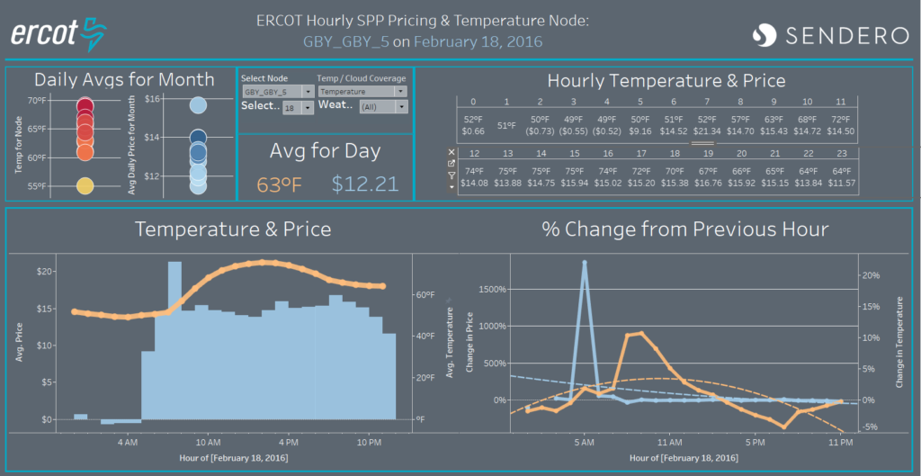
 Benefits of data visualization
Data analytics are more necessary in business with each passing year, and data visualization can help companies and organizations unlock insights, knowledge, and indicators that might otherwise go unseen. Even for those who aren’t visual learners, having the ability to roll up hundreds (or thousands) or rows of data into easy-to-consume, bite-sized visuals is a game changer. This is another benefit of data visualization, allowing leaders to spot patterns and make decisions based on facts.
It goes without saying that there is more to decision making than following data blindly. Things such as objective feedback, intangibles, and ultimately gut-feel all play roles in making decisions, but data, and specifically, effective visualizations offer organizations a secret weapon.
There are countless data manipulation and visualization tools on the market that can get the job done. From a simple table in Excel to illustrate a point, to a complex geo-spatial illustration in one of the more robust platforms or tools, visualizations come in all shapes and sizes.
Throughout my experience working with Sendero’s clients and working on internal initiatives, two tools have stood out as very good options to create meaningful visualizations: PowerBI and Tableau.
All in all, the tool is only a small component of creating visualizations that provide insight to a set of data. The large component is how the data visualizer uses the tools at their disposal to tell a story and illustrate a point.
Over the past five years, I’ve seen firsthand how quickly data visualization changes –whether looking at the enhanced functionality within the tool or industry best practices, data trends are evolving year by year.
I’d like to take a look at some trends that should be considered when constructing a data visualization, comprehensive dashboard or report:
Real-time dashboards
A great part of data visualization that has changed recently has been the ease of use when connecting a dashboard or report to real-time data sources. There have been many times during my career where I’ve created a dashboard with the intent to show real-time status for an initiative or progress during a project. Connecting your dashboard to a data source that is updated at a consistent cadence, whether it is every second or every day, allows the audience to get a clear understanding of the current state of things.
I was on a project recently where hundreds of Business Unit Coordinators were executing a series of tasks for a soft launch in a tight window of time. Our team created a dashboard and process in order to track status so we could manage any potential hiccups during the launch. The dashboard provided leadership with a high-level view of progress with also the ability to drill down and escalate roadblocks accordingly, when needed.
Many different visualization charts
Data chart and graph types are constantly progressing. The tried-and-true bar charts, line charts, and histograms still have a fundamental place in dashboarding. They also may leave some intrigue to be desired if standing alone. This is where the advancement in analytics and visualization has truly come a long way. There are countless chart types to leverage to illustrate a point; a few of my favorites are listed below:
The point here is to illustrate how abundant the options are when creating a visualization or piecing together a dashboard. The tools (chart types) and clay (raw data) are both at the disposal of the artist (data visualizer) and it’s now up to them to create something worthwhile.
Data storytelling
Data storytelling is the practice of illustrating a point or narrative in a way that is easy to comprehend or understand. This is the point where art meets science. Creating an effective visualization should always be aimed at making a point or uncovering a truth. Anyone can throw together a handful of charts and graphs onto a dashboard, but if the final product is not intuitive and cohesive, it can leave the viewer confused and scatterbrained.
Effective data visualists start creating a visualization by first asking what they are hoping their audience to gain from looking at the future final product. Sometimes this can be broad, such as uncovering a pattern or truth and sometimes this will be specific, where the hope is to drive home a point. When attempting to make a point with data, it is important to constantly think through what you can do to tailor your dashboard to highlight the point that you are trying to make. Attempting to tell a story with your data throughout the creation of a dashboard will ensure that the final product effectively informs and maybe even captivates your audience.
Business insights
Data & Analytics
Digital twins are emerging as practical change agents in complex operations – helping organizations understand how work…
Read article
Data & Analytics
You have the data. The problem isn’t technology; it’s the last mile gap between insight and action.
Read article

Data & Analytics
To truly maximize deal value in manufacturing M&A, leaders must prioritize proactive digital infrastructure alignment,…
Read article

Data & Analytics
Many utilities struggle to harness the power of their data effectively. The main obstacle? Data silos.
Read article

Data & Analytics
As companies wind down from the holiday rush, it’s the perfect time to reflect on the inventory forecasting strategies…
Read article

Data & Analytics
The use of decision intelligence tools can help utility providers make better decisions through a data-driven approach…
Read article